Giant Eagle: “Switch & Save”
An innovative approach to help customers save money while supporting a broader company goal of increasing margin and brand awareness.
The Problem
Customers consistently told us they were struggling with the total cost of their shopping trip. Sales and promotions helped, but only temporarily. As a regional grocery retailer with less buying power than national chains, there was a limit to how much we could sustainably reduce prices.
At the same time, our corporate strategy prioritized increasing awareness and adoption of our Own Brand products – which offer lower prices to customers and higher margins for the company.
Could we create an experience that helped customers discover lower‑priced Own Brand alternatives in their cart, letting them test quality, experience savings, and ultimately build trust in the product line? Our hypothesis was that satisfied customers would return more often, purchase more, and increase loyalty at a time when overall brand affinity was dipping due to broader economic pressures in 2025.
We called the idea “Switch & Save”.
GOALS
In collaboration with the Product Management team, we landed on several quick goals for the pilot:
Increase Own Brand revenue (more Own Brand items added to cart)
Improve perceived value (measured through our Voice of Guest platform)
Maintain online order revenue with the feature active
Leverage existing search platform APIs for matching and recommendations
Sketching and ideation
Early sketches explored integrating savings prompts directly into our existing product tiles. But I kept returning to the idea of a dedicated savings modal. Stakeholder enthusiasm was initially skeptical, but I continued refining the concept.
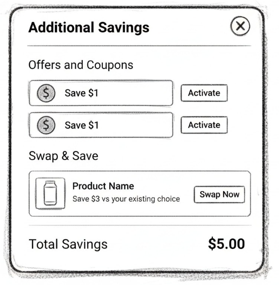
I used Bolt to quickly build a working prototype. It wasn’t on‑brand visually, but it successfully generated excitement and aligned the team around exploring the idea further. It also helped demonstrate how total potential savings could appear inline with each product.
Wireframes
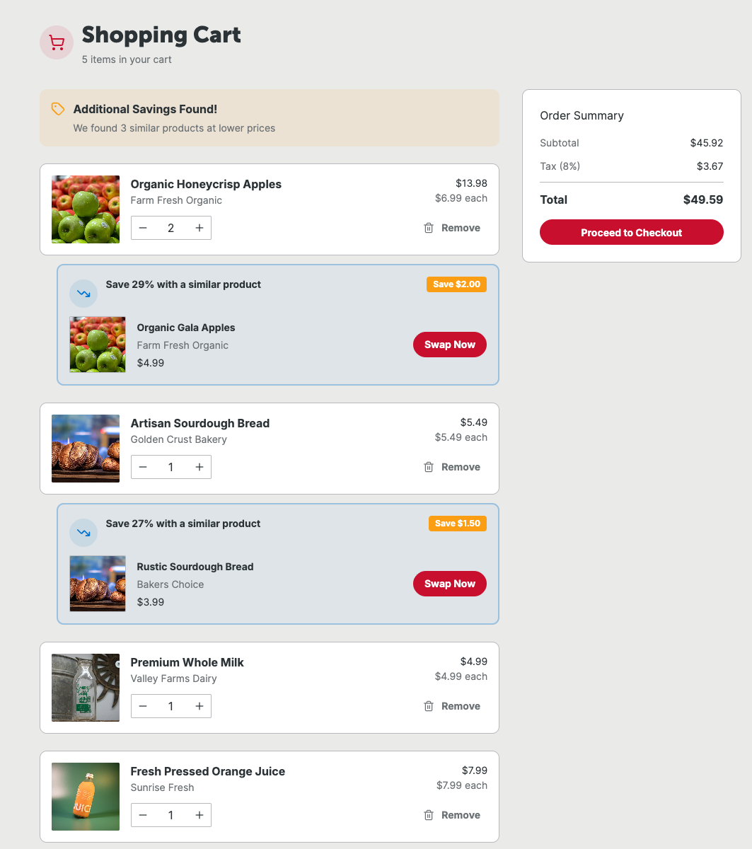
As a product team, we developed several design options and eventually gravitated toward an approach where the savings opportunities were presented inline with product cards in the cart. I still had concerns: Would customers be overwhelmed by too much data during a critical step in the shopping funnel?
My original concept presented total savings in a cleaner, more centralized way. My priority wasn’t being “right,” but ensuring we delivered value without introducing friction. I wanted to bring this idea back to the wireframes.
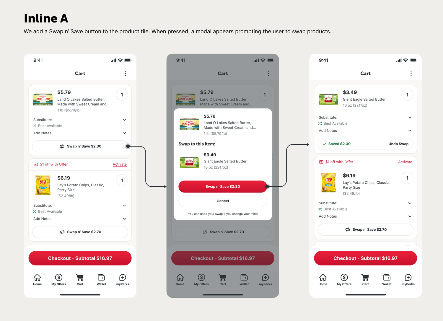
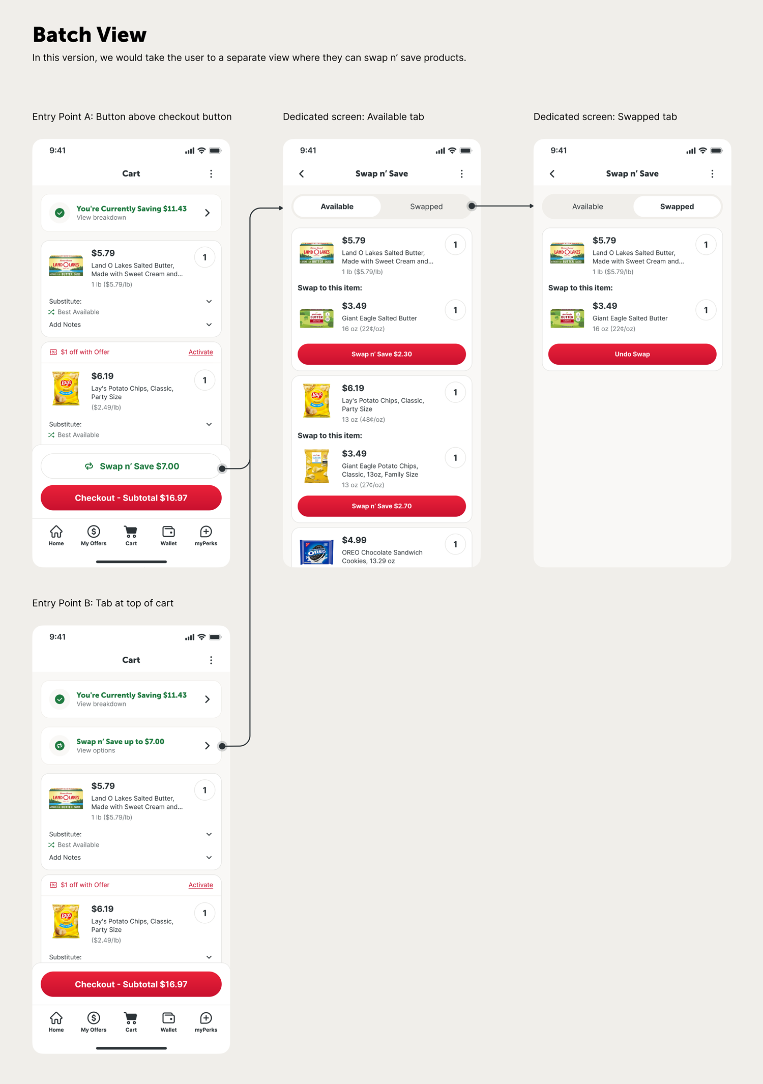
There were also two entry points discussed, and our engineers felt the component at the top of the cart would be easier to implement.
To help us make the most informed decision, I sent both designs – Inline and Batch – through usability testing to gain insights from real users.
USER TESTING
The results were clear: the Batch version won decisively.
Key findings included:
Users felt it saved time and required fewer clicks.
It was easier to scan and select replacement items.
They appreciated seeing total savings upfront before making changes.
The Batch experience made it easier to change their mind about their switched products.
We observed a 40% reduction in “struggle” moments compared to the Inline version.
Final Prototype
Following several UI refinements, Figma Make was used to build the final presentation prototype. We shared this alongside the usability results in a stakeholder review.
Next Steps
With overwhelmingly positive feedback, the Own Brands stakeholder team was excited to move forward with a pilot on the web experience.
We are now finalizing business rules and engineering feasibility. The pilot will launch for a few key product groups (such as paper goods) within the next 3–6 months. It will initially be shown to a small percentage of web guests, with traffic and category expansion planned as results are validated.